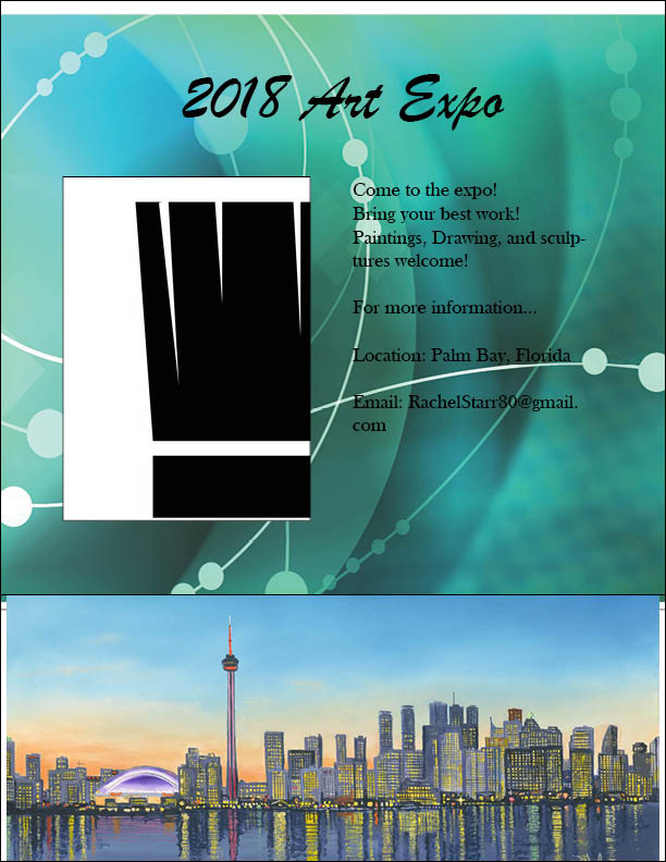
This is my project 1.
I like how the pictures look.
If I were to do this again I would take my time.
Advice I would give tot someone who hasn't done this yet would be to use color.
Create a Conference Poster using Adobe InDesign. This video series is meant to learn the tools of InDesign.
I like how the pictures look.
If I were to do this again I would take my time.
Advice I would give tot someone who hasn't done this yet would be to use color.
Create a Conference Poster using Adobe InDesign. This video series is meant to learn the tools of InDesign.

|
|
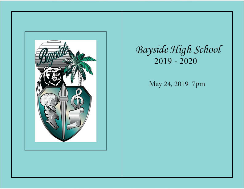
This is my project 2.
I like how the colors look.
If I were to do this again I would add more pictures.
Advice I would give to someone who hasn't done this would be to be creative.
Create a Yearbook Spread using Adobe InDesign. This video series is meant to learn the tools of InDesign.
I like how the colors look.
If I were to do this again I would add more pictures.
Advice I would give to someone who hasn't done this would be to be creative.
Create a Yearbook Spread using Adobe InDesign. This video series is meant to learn the tools of InDesign.
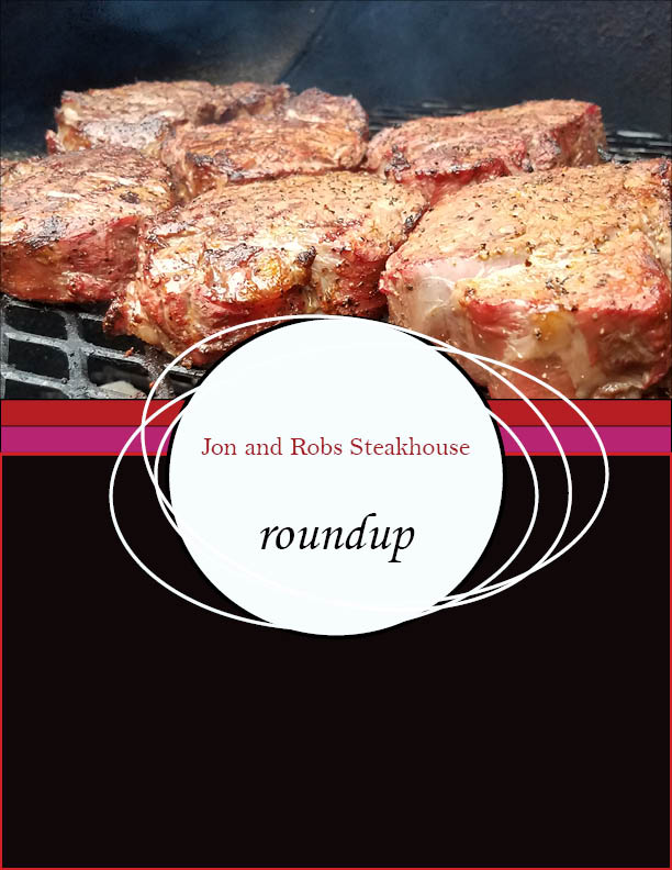
This is my project 3.
I like how the meat picture turned out.
If I were to do this again I would make it more detailed.
Advice I would give to someone who hasn't done this yet would be to make it unique.
Create a Menu using Adobe InDesign. This video series is meant to learn the tools of InDesign.
I like how the meat picture turned out.
If I were to do this again I would make it more detailed.
Advice I would give to someone who hasn't done this yet would be to make it unique.
Create a Menu using Adobe InDesign. This video series is meant to learn the tools of InDesign.
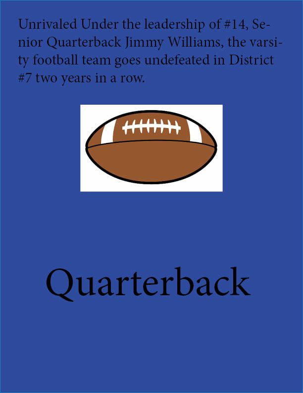
This is my graduation poster.
I like how the logo looks.
If I were to do this again I would make it more detailed.
Advice I would give to someone who hasn't done this yet would be to be creative.
I like how the logo looks.
If I were to do this again I would make it more detailed.
Advice I would give to someone who hasn't done this yet would be to be creative.
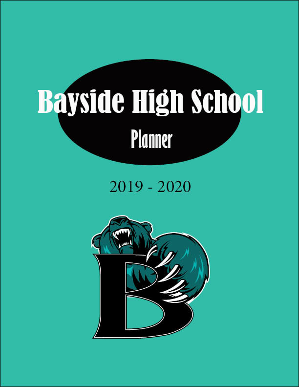
This is my Planner.
I like how the teal looks.
If I were to do this again I would make it more detailed.
Advice I would give to someone who hasn't done this yet would be to be creative.
I like how the teal looks.
If I were to do this again I would make it more detailed.
Advice I would give to someone who hasn't done this yet would be to be creative.
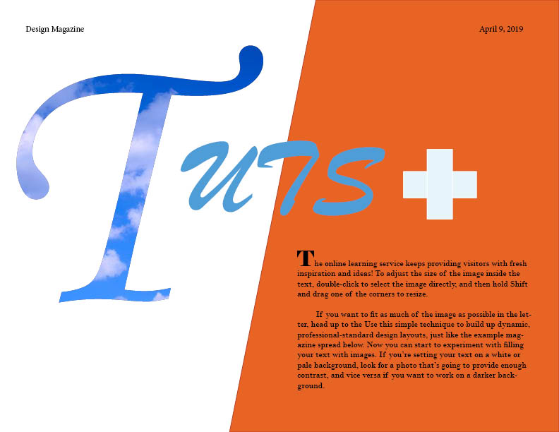
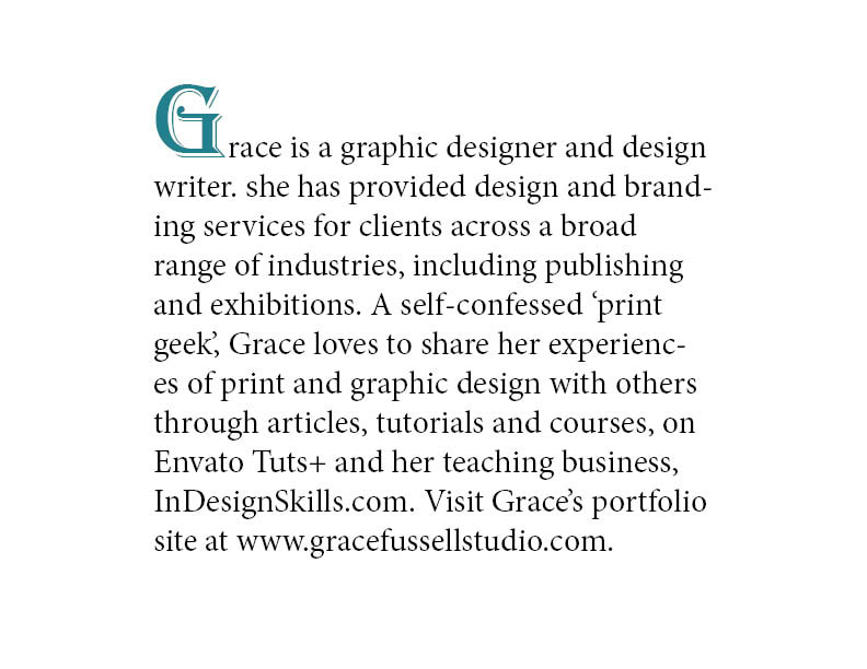
Placing an image inside a single character can give your layouts a super-professional, design-forward look. Learn how to transform your typography into picture frames, to create a dramatic effect. You’ll often see this sort of design technique being used in high-end magazine design, to give added impact to headlines and to showcase a photo in a unique and eye-catching way. It can also add drama to book design, marketing materials and poster design.This is my typography into picture frames.
I like how organized it looks.
If I were to do this again I would make the cloud letter better looking.
Advice I would give to someone who hasn't done this yet would be to take your time.
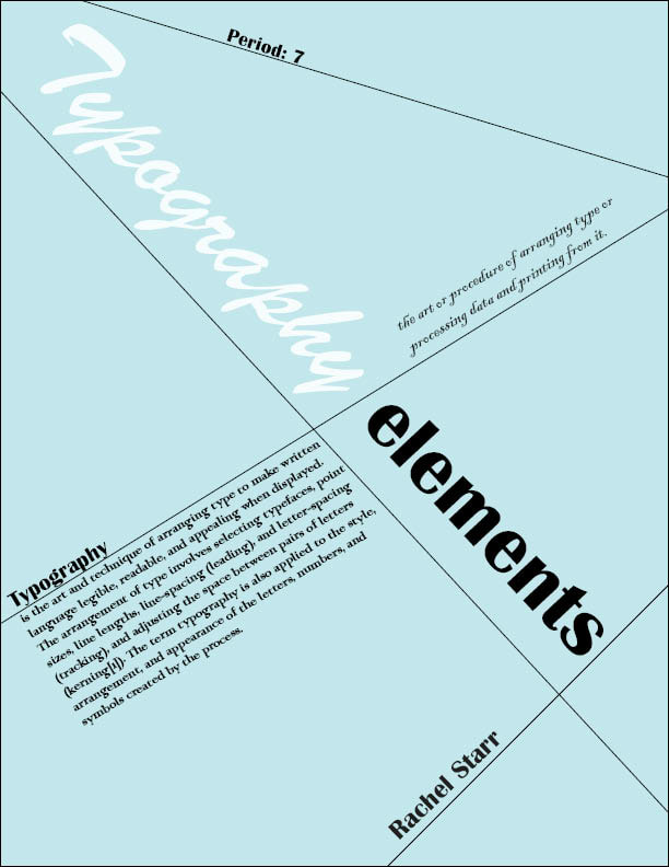
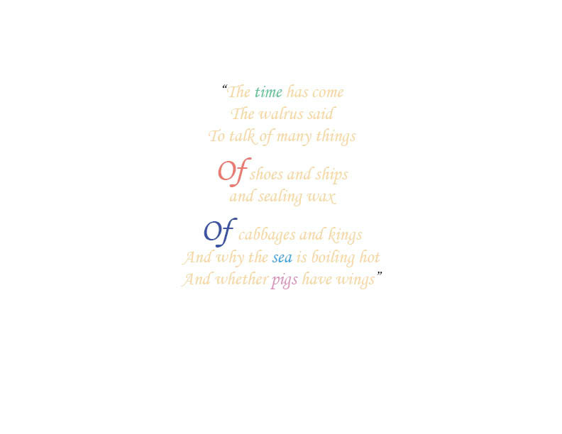
InDesign is the best Adobe tool for creating traditional and expertly crafted typography. Designers often are quick to jump over to Illustrator or Photoshop if they want to create more unique and contemporary text effects. However, with a little know-how you can create cutting-edge, creative text effects without ever having to leave InDesign. This tutorial shows you how to create five striking typographic effects using tools and tricks available to you in InDesign. Students followed these tutorials individually, then tweaked the steps to make their own unique styles.
This is my 5 High Impact typography effects.
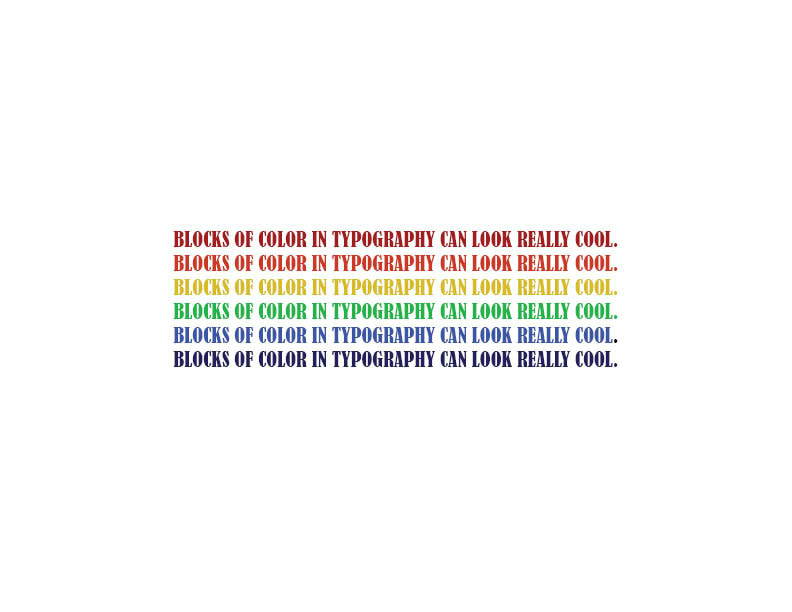
I like how the colors look.
If I were to do this again I would add more words.
Advice I would give to someone who hasn't done this yet would be to be creative with the placement of the words.
This is my 5 High Impact typography effects.
I like how the colors look.
If I were to do this again I would add more words.
Advice I would give to someone who hasn't done this yet would be to be creative with the placement of the words.
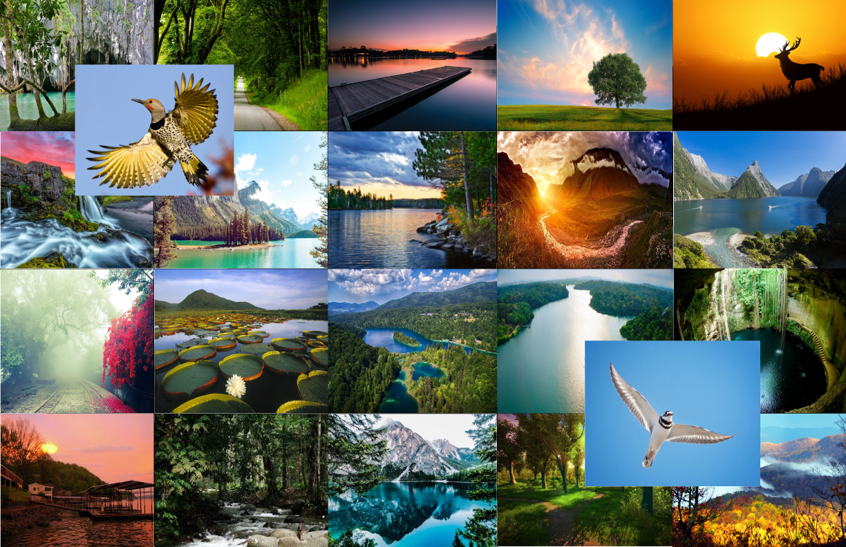
This is my design mood board.
Moodboards are a great way of organizing your ideas for a design project. You can simply use a moodboard as a personal creative aid, providing inspiration and direction for tackling a brief. Moodboards are also fantastic methods of communicating your creative ideas to a client. A polished, beautiful board can give your client an immediate understanding of your style and intentions for a project, and can help to get them on board (no pun intended!) with your ideas much quicker than verbal communications could do alone.In this tutorial you’ll learn how to put together a grid-based moodboard, and look at how you can combine images, color, textures and typography to give the board a unified, professional look.
I like how the theme turned out.
If I were to do this again I would make it more detailed.
Advice I would give to someone who hasn't done this yet would be to be creative with the colors.
