This is my Fibonacci Rectangle.
I like how the fish turned out.
If I were to do this again I would try to make it faster.
Advice I would give to someone who hasn't done this yet would be to make the Rectangles evenly.
I like how the fish turned out.
If I were to do this again I would try to make it faster.
Advice I would give to someone who hasn't done this yet would be to make the Rectangles evenly.
This is my turtle logo.
I like how the turtle turned out.
If I were to do this again I would make it more detailed.
Advice I would give to someone who hasn't done this yet would be to take your time.
I like how the turtle turned out.
If I were to do this again I would make it more detailed.
Advice I would give to someone who hasn't done this yet would be to take your time.
This is my fish logo.
I like how the fish tuned out.
If I were to do this again I would make the lines on the fish a little smoother.
Advice I would give to someone who hasn't done this yet would be to be careful when making the fish.
I like how the fish tuned out.
If I were to do this again I would make the lines on the fish a little smoother.
Advice I would give to someone who hasn't done this yet would be to be careful when making the fish.
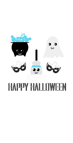
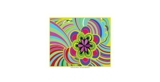
These are my Halloween characters.
I like how the font looks.
If I were to do this again I would make it more detailed.
Advice I would give to someone who hasn't done this yet would be to be creative.
I like how the font looks.
If I were to do this again I would make it more detailed.
Advice I would give to someone who hasn't done this yet would be to be creative.

Scream is a classic slasher movie series, and this tutorial, teaches how to draw the famous scary mask of the mysterious killer known as Ghostface. Practice drawing skills and learn how to play with different shapes and strokes to give dimension to the mask and create shadows only where needed.
This is my scream ghost face.
I like how the background turned out.
If I were to do this again I would make the lines a little straighter,
Advice I would give to someone who hasn't done this before would be to use gradients.
This is my scream ghost face.
I like how the background turned out.
If I were to do this again I would make the lines a little straighter,
Advice I would give to someone who hasn't done this before would be to use gradients.

This is my spooky background.
I like how the gradients turned out.
If I were to do this again I would make the houses look better.
Advice I would give to someone who hasn't done this yet would be to read the instructions carefully.
I like how the gradients turned out.
If I were to do this again I would make the houses look better.
Advice I would give to someone who hasn't done this yet would be to read the instructions carefully.

This transparent ruler was created using the grid and the snap to grid feature. Several paths were created with accurate dimensions. Using multiple fills and stroke with various blending modes and opacity percentages create the overall ruler illustration. For the final details include using a built in brush and some basic effects.
These are my transparent rulers.
I like how the opacity turned out.
If I were to do this again I would make the ruler markings better.
Advice I would give to someone who hasn't done this yet would be to be organized with it.
These are my transparent rulers.
I like how the opacity turned out.
If I were to do this again I would make the ruler markings better.
Advice I would give to someone who hasn't done this yet would be to be organized with it.
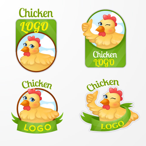
This is my chicken logo.
Recolor
Recoloring artwork.
I liked how the colors looked.
If I were to do this again I would Make the colors have an order.
Advice I would give to someone who hasn't done this yet would be to choose a different image.
I liked how the colors looked.
If I were to do this again I would Make the colors have an order.
Advice I would give to someone who hasn't done this yet would be to choose a different image.
week 12 - Demonstrate the Design Element "Shape" in an Adobe Illustrator graphic
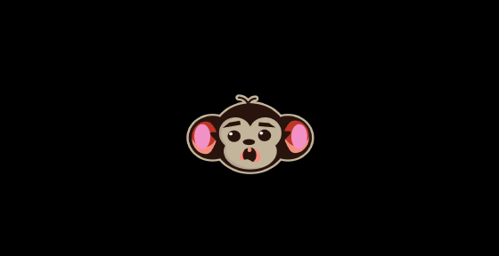
This is my Shape drawing.
I like how the monkey looks.
If I were to do this again I would Make the eyebrows looks better.
Advice I would give to someone who hasn't done this yet would be to take your time.
This is my Shape drawing.
I like how the monkey looks.
If I were to do this again I would Make the eyebrows looks better.
Advice I would give to someone who hasn't done this yet would be to take your time.

week 12 - Demonstrate the Design Element "Mass" in an Adobe Illustrator graphic
This is my mass drawing.
I like how the shadow turned out.
If I were to do this again I would make it more detailed.
Advice I would give to someone who hasn't done this yet would be to use shadows.
This is my mass drawing.
I like how the shadow turned out.
If I were to do this again I would make it more detailed.
Advice I would give to someone who hasn't done this yet would be to use shadows.

week 12 - Demonstrate the Design Element "Texture" in an Adobe Illustrator graphic
This is my texture drawing.
I like how the gradient turned out.
If I were to do this again I would finish it.
Advice I would give to someone who hasn't done this yet would be to put in a gradient.
This is my texture drawing.
I like how the gradient turned out.
If I were to do this again I would finish it.
Advice I would give to someone who hasn't done this yet would be to put in a gradient.

week 12 - Demonstrate the CRAP Design Principle "Contrast" in an Adobe Illustrator graphic
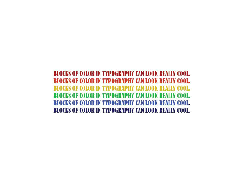
This is my Contrast Drawing.
I like how the colors look with each other.
If I were to do this again I would make it more detailed.
Advice I would give to someone who hasn't done this yet would be to use colors that look good together.
This is my Contrast Drawing.
I like how the colors look with each other.
If I were to do this again I would make it more detailed.
Advice I would give to someone who hasn't done this yet would be to use colors that look good together.
week 12 Advanced Graphics - Demonstrate the CRAP Design Principle "Repetition" in an Adobe Illustrator graphic
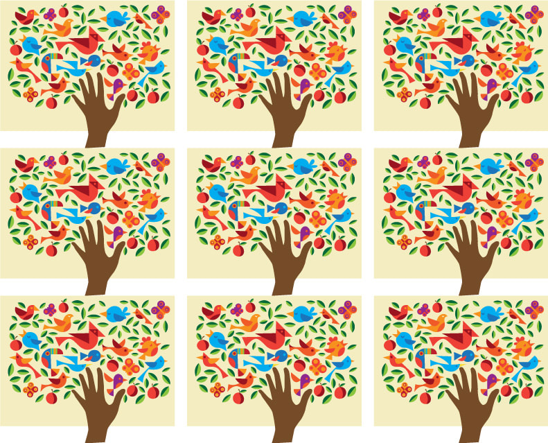
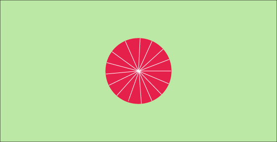
This is my Repetition drawing.
I like how the lines turned out.
If I were to do this again I would make the drawing more interesting,
Advice I would give to someone who hasn't done this yet would be to take your time.
This is my Repetition drawing.
I like how the lines turned out.
If I were to do this again I would make the drawing more interesting,
Advice I would give to someone who hasn't done this yet would be to take your time.
week 12- Advanced Graphics - Demonstrate the CRAP Design Principle "Alignment" in an Adobe Illustrator graphic
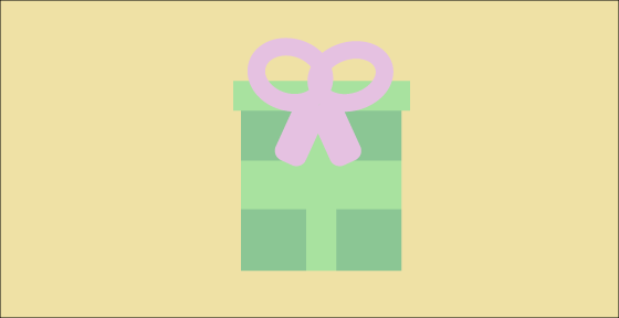
This is my Alignment Drawing.
I like how the bow turned out.
If I were to do this again I would make the box more detailed.
Advice I would give to someone who hasn't done this yet would be to make sure the colors look good together even the background.
This is my Alignment Drawing.
I like how the bow turned out.
If I were to do this again I would make the box more detailed.
Advice I would give to someone who hasn't done this yet would be to make sure the colors look good together even the background.

week 12 - Demonstrate the Crap Design Element "Proximity" in an Adobe Illustrator graphic
This is my proximity drawing.
I like how the top of the ornament turned out.
If I were to do this again I would Make the Ornament more colorful.
Advice I would give to someone who hasn't done this yet would be to be creative.
This is my proximity drawing.
I like how the top of the ornament turned out.
If I were to do this again I would Make the Ornament more colorful.
Advice I would give to someone who hasn't done this yet would be to be creative.

Use the envelope distort > make with mesh to distort text to create an image of your choice
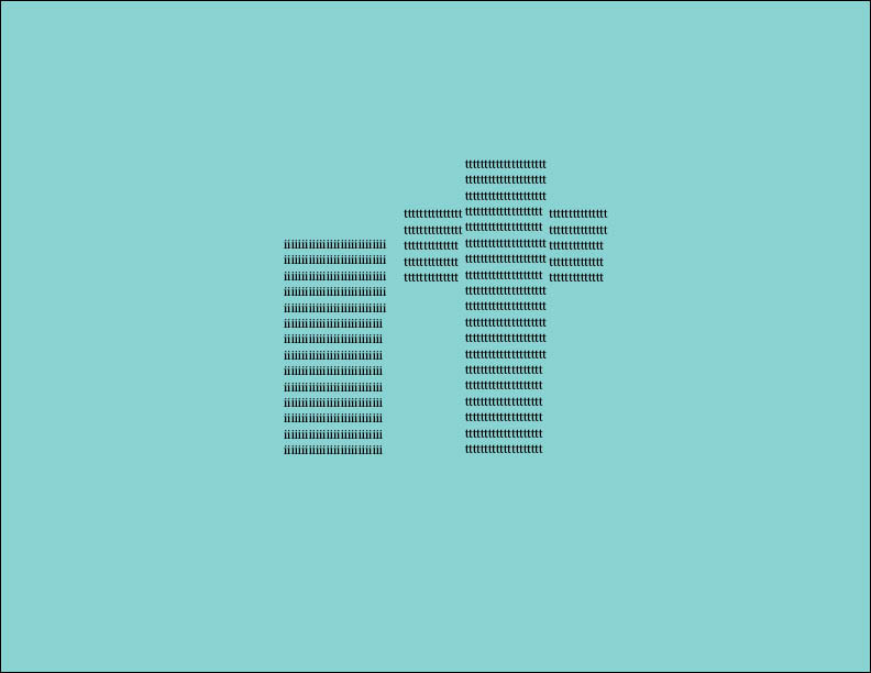
This is my text portrait.
I like how the color turned out,
If I were to do this again I would I would add more words.
Advice I would give to someone who hasn't done this yet would be to take your time.

Use the 3D rotating tools to add 3D text effects to a 6 letter word
This is my 3d text shape.
I like how clean the lines look.
If I were to do this again I would make it more detailed.
Advice I would give to someone who hasn't done this yet would be to be careful with the placement of the words.
This is my 3d text shape.
I like how clean the lines look.
If I were to do this again I would make it more detailed.
Advice I would give to someone who hasn't done this yet would be to be careful with the placement of the words.
Use the 3D rotating tools to add 3D text effects to a 6 letter word
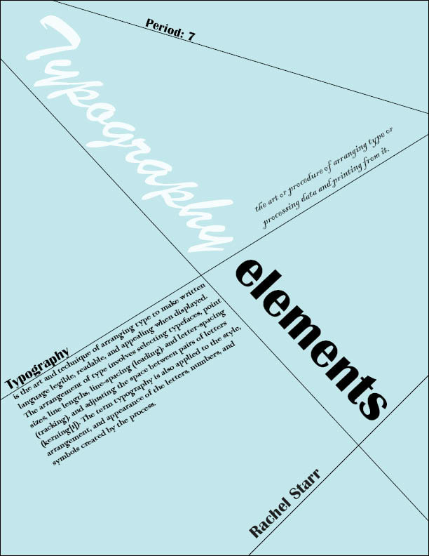
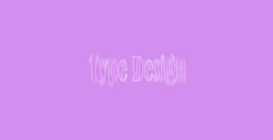
This is my type design.
I like how it looks like its moving.
if I were to do this again I would add more to the background.
Advice I would give to someone who hasn't done this yet would be to be creative with the effects.
This is my type design.
I like how it looks like its moving.
if I were to do this again I would add more to the background.
Advice I would give to someone who hasn't done this yet would be to be creative with the effects.
Awordmark,word mark, orlogotypeis usually a distinct text-only typographic treatment of the name of a company, institution, or product name used for purposes of identification and branding
These are my watermark logos.
I like how The colors look.
If I were to do this again I would make them more detailed.
Advice I would give to someone who hasn't done this yet would be to be creative with the designs.
These are my watermark logos.
I like how The colors look.
If I were to do this again I would make them more detailed.
Advice I would give to someone who hasn't done this yet would be to be creative with the designs.
set up a simple grid and how to create the main shapes using basic tools and vector shape-building techniques along with the Live Corners feature
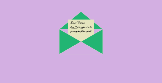
This is my letter to santa.
I like how the colors look together.
If I were to do this again I would make it more detailed.
Advice I would give to someone who hasn't done this yet would be to take your time.
This is my letter to santa.
I like how the colors look together.
If I were to do this again I would make it more detailed.
Advice I would give to someone who hasn't done this yet would be to take your time.
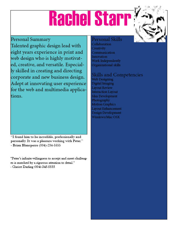
Create a Menu using Adobe InDesign. This video series is meant to learn the tools of InDesign. You’ve got mad skills- so show them off! Make a resume’ that will show your design skills in words as well as design.
This is my resume.
I like how the face turned out.
if I were to do this again I would make it more detailed.
Advice I would give to someone who hasn't done this yet would be to make it colorful.
This is my resume.
I like how the face turned out.
if I were to do this again I would make it more detailed.
Advice I would give to someone who hasn't done this yet would be to make it colorful.
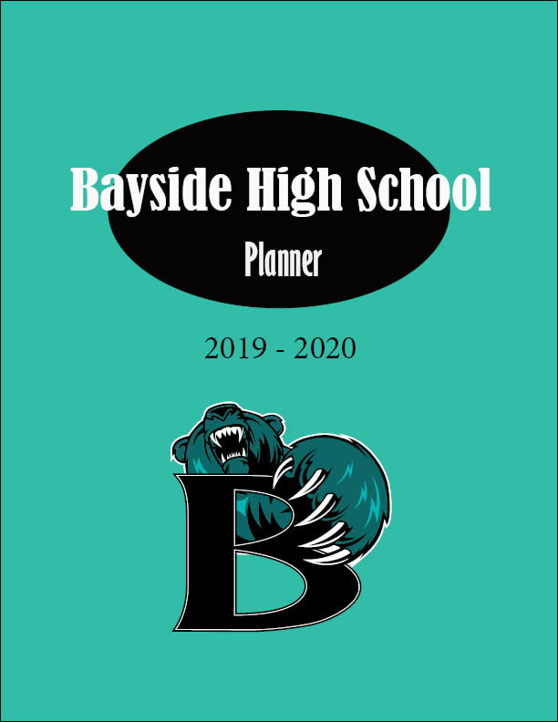
This is my planner.
I like how the font looks.
If I were to do it again I would make it more detailed.
Advice I would give to someone who hasn't done this yet would be to be creatve.
I like how the font looks.
If I were to do it again I would make it more detailed.
Advice I would give to someone who hasn't done this yet would be to be creatve.